ONE OF THE BEST: JAMES WALSH AT BERRY CAMPBELL
January 28, 2020 - Piri Halasz for From the Mayor's Doorstep
It was standing-room-only at the opening for "James Walsh: The Elemental" at Berry Campbell (through February 8). Nor did this long-awaited show disappoint: it more than lives up to advance expectations and shows this gifted mid-career artist spreading joy along with pigment and molding paste in peak form. Indeed, James Walsh is one of the best.
True, he has not gone off on any wild tangents in this exhibition. He is still creating small to medium-sized paintings on canvas, using multi-hued acrylics mixed with molding paste. And (as far as I know) he still manipulates the molding paste with everything from his hands to a battery of tools.
The molding paste enables him to alter the thickness of his medium from raised curls, twirls, swirls, twists, blobs, and upward or downward strokes or pours of color right down to only barely tinted and scraped areas of canvas -- often all in the same image.
He has become if anything more adept in orchestrating these opposites from thick to thin. And he is experimenting – if still very carefully – with creating larger and smaller pictures.
The last time I reviewed a display of his work (at Berry Campbell on June 22, 2014), the smallest painting was 18" x 14" and the largest was 41" x 27¾ ". In this show, the largest painting is 48" x 36" and the smallest is only 6¼" x 4".
The former is entitled "Opus Eight, Number Twelve (2017). It is unique in its scale, and hangs in a prominent position in the first large space at Berry Campbell. Done in blacks, browns and other autumnal colors, it is very authoritative-looking, and fits nicely into this front space, which I mentally characterized as occupied by the most ambitious paintings in the show.
(However, I have to confess that the smaller "Crin-Crin" (2019), hanging just to the right of "Opus Eight," seemed to me more successful. With its green vertical on the top half of the painting, and horizontal strokes below, I was also mysteriously reminded of "The Piano Lesson" (1912) by Henri Matisse. Aren't art critics irritating?
The third space at Berry Campbell, at the very back of the gallery, is one that in this case I characterized as occupied by the most experimental paintings in the show. This is where all eight of the little tiny paintings are clustered together. As they are all untitled, I can describe them only by their colors & locations, and there were three that in particular I was attracted to, to wit:
1) The smallest, a 2017 vertical on the left-hand end of the display; made of mostly blues, with a long red line to set them off;
2) One of the two largest, a 10" x 8" 2018 vertical, on the center right dominated by a speckled gray-and-white form curiously suggestive of a male torso and
3) Another tiny one on the far right, measuring 7¼" x 5", also done in 2018 and endowed with a curly, swirling red and green area above, plus three round red dots like peas below – maybe it was the red and green, which are the Hungarian national colors, which appealed to the Hungarian in me…..
Also in this back gallery, on the wall facing the street, is a full-size, wild-and-wooly number entitled "Colorbook: Water Games" (2018). Nearly square, it is built around two tall, wavy multi-hued bands of paint that are slanted from the center top to the lower left, so that they look like two human figures, hastening toward or away from something.
I was initially inclined to call them "Orpheus and Eurydice," from two mythological characters fleeing Hades (that small red-and-white smear to the right of Orpheus is his lyre). But then I thought it was more like Adam and Eve being driven out of Eden, as depicted by Masaccio in the Brancacci Chapel. Anyway, both shapes were indefinably human and at the same time, Old Masterly….
But I am saving the best for last, which for my money are the seven paintings in the middle space at Berry Campbell – every one of them a shining success, a mini-masterpiece. I don't know why they worked so well, except that maybe the artist wasn't trying so hard, or slathering on quite so many colors, or quite so much paste. Call me an old fogey, if you like – but I really liked these paintings.
To take them in sequence, the first I encountered (on the wall of this space facing north) was "Overtones" (2019). A most beguiling number, its primary shape is a sidewise black semicircle over the left, with a field of blues and greens under that semicircle and over to the right, verticals in yellow, pink, white and greens. A lovely flowing feeling to the paint in the field and on the right…..
Next, on the wall facing west, we have "The Elemental" (2019), the picture for which the entire show is named. It is truly elegant, even though (or perhaps because) the surface is relatively flat and simply colored. On the right is a vertical area of opaque blue and black; on the left, balancing it neatly, is another vertical area of lighter, greenish black speckled with sandy yellow. Really, there are only four colors employed here, but pulling it all together is a very forceful right-to-left drag in the drawing…..
To the left of "The Elemental," is "Sand Sound" (2017). This one is very pale, with wonderful misty greenish grays. The thick, shaggy piles of paint in the lower half are played off against thin glossy pools of paint in the top half, and again a very limited color range – one of the most limited in the entire show.
On the north wall, facing toward the back of the gallery, are two more paintings of a very high caliber, "Positive Venus" (2018) and "Blend" (2018). "Positive Venus" is another pale picture, but with thin painting only at the top—lemon yellow, with pale blue grays at the very top—and at the bottom, thick gobs of white with a yellowish tinge, and again blue underpainting showing through right at the bottom.
"Blend" has brighter colors and a real back-and-forth whipsaw motion to its horizontal strokes. It has red at its base and at the right, taking pride of place over the complementary green on the top and at the left, and a canny mix of opaque and glossy throughout.
On the west wall of this space are two more beauties, "Natural" (2019) and "Flint Sky" (2019).
"Natural" has broad horizontal strokes of palest gray across its top and its bottom, but in the middle it has a great, surging horizontal sweep of a whitish gray blob with edgings of mustard and touches of red. The whole composition reminds me faintly of Robert Rauschenberg's famous combine entitled "Bed," but unlike the Rauschenberg, it's not intended to shock anybody, merely to give pleasure – in which it succeeds truly well.
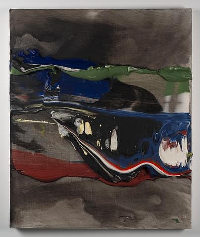
The best of these seven paintings is the one I've left to last, and chosen to reproduce – even though a camera can't really do it justice. "Flint Sky" is built up with paint through its middle again, but with a matching top and bottom of thin and thinner bands of black, which read as medium grays and serve as backdrop for the main action.
Below the top pale black introductory area, and across the middle of this canvas, all kinds of things are going on, unified by violent, horizontally swiveling strokes of paint. We see thick combos of soft blue and green, small inserts of white, and then more violently zig-zagging horizontal sweeps of blue and black of tremendous force--highlighted by narrow lines of red & white.
Finally at the bottom of all of this, we get an area of rust, superimposed before the quiet field of light black at the base of the painting saves the whole from sinking down to drown in some sort of mythological whirlpool.
Back to News